Page 58 of 63
Re: Signature/Banner Topic
Posted: Sun Jul 27, 2014 8:28 pm
by Master
Hmm, I think my current sig is the fifth or sixth I've had since I've joined. I recall switching to my original sig as part of last year's 10th Anniversary stuff though.
Re: Signature/Banner Topic
Posted: Sun Jul 27, 2014 8:29 pm
by rolesfamily
I think the Rayman Zone culture was way more sig orientated. We used to swap all the time. I might use some of those old sigs for a little bit. Don't get offended if I do Master, you know I love the sig you made for me long time!!!! <3 <3
Re: Signature/Banner Topic
Posted: Mon Jul 28, 2014 2:22 am
by Shrooblord
Serza5 wrote:Can I pay someone to draw me a super sexy Wallace render?
Hm, you still want this? I could make you one when I get back home in a month's time (though I can begin sketching on paper already - see if you like where it's going). I'd need a little more specifics though - what kind of 'sexy' are you looking for?

===
Yeah, roles, some of them are quite good! I like the red swirly ball thing and the Hoodboom ones best.
I'm thinking of making myself a new sig in celebration of my game stepping over from conceptual to 'actual' development. Don't know exactly what it will be yet, but I had in mind something along the lines of cinematic storyboard mash-ups, comic book style. Looks pretty neat in my head - let's see how it works out on paper.

Re: Signature/Banner Topic
Posted: Mon Jul 28, 2014 3:39 am
by Serza5
Oh my now that is old. Very old in fact. Although i'm tempted to pick up the offer anyway.
As for sexy I mean- er, sexy?
Re: Signature/Banner Topic
Posted: Mon Jul 28, 2014 4:25 am
by Shrooblord
Well lots of people find other things sexy.

I can try some things, but if possible, something more of a direction to go in would be good; like, do you want him shirtless, or in a specific pose, or basically just handsome and dashing or...?
Re: Signature/Banner Topic
Posted: Mon Jul 28, 2014 9:15 am
by rolesfamily
It brings back a lot of childhood memories looking at those old sigs, it makes me feel excited about the Rayman Zone again! Haha.
Re: Signature/Banner Topic
Posted: Mon Jul 28, 2014 4:33 pm
by Serza5
Shrooblord wrote:Well lots of people find other things sexy.
I can try some things, but if possible, something more of a direction to go in would be good; like, do you want him shirtless, or in a specific pose, or basically just handsome and dashing or...?
Just himself basically; just his regular sexy self.
Only thing that i'd despise is if you made him look like girly moe garbage.
Re: Signature/Banner Topic
Posted: Mon Jul 28, 2014 6:31 pm
by rolesfamily
You guys don't seem to go through as many sigs as people did back on RZ!
Re: Signature/Banner Topic
Posted: Mon Jul 28, 2014 9:44 pm
by Shrooblord
Serza5 wrote:Only thing that i'd despise is if you made him look like girly moe garbage.
Can't say I get exactly what that means, but I'll try my best not to accidentally turn him into a tomgirl. I'll get right to sketching!
Re: Signature/Banner Topic
Posted: Mon Jul 28, 2014 9:47 pm
by rolesfamily
It's nice to see that the signature culture still survived here. I've been a part of a lot of forums since the RZ and for some reason it's the Rayman community that just loves their sigs!
I'd say you guys are the proper organic forum users.
Re: Signature/Banner Topic
Posted: Mon Jul 28, 2014 10:11 pm
by saerleiya
With all the contests and stuff happening here, yeah it's normal. Plus a lot of active members are actually artists in their spare time, making/playing music or drawing/making art using digital softwares.
I could do it too, but I'm a bit lazy right now...I should do several sigs in the future. I have many ideas, but I haven't been in the right mood to make them happen.
I particularly like Earth Gwee's sig: this drawing is gorgeous. I also remember Master's Doctor who sig, and Ad's magician, and Hunch's German SpongeBob...derp.
Also Shrooblord had several sig steps for his current sig. Serza's current sig is very interactive oriented too: using the randomizer plus three different images with specific features makes it look incredibly innovative, yet it is simple.
Re: Signature/Banner Topic
Posted: Mon Jul 28, 2014 11:11 pm
by rolesfamily
I think I'm going to start using some of my old RZ sigs just for fun. I'll start using them progressively after RD

Re: Signature/Banner Topic
Posted: Tue Jul 29, 2014 12:23 am
by Shrooblord
Yeah, for anyone participating in RD (so that'll be everyone or OFF WITH YER HEAD), most if not all users will probably have disabled signatures, so while it's a cute gesture to have one specifically for RD, don't expect too much attention towards it.
Re: Signature/Banner Topic
Posted: Tue Jul 29, 2014 1:54 am
by Master
Pretty much what Shroobie stated, speed is the name of the game. Theatrics tend to take a backseat there.
Re: Signature/Banner Topic
Posted: Tue Jul 29, 2014 3:21 am
by saerleiya
Hey, the sig randomizer works here! Yay!
New sig made this evening...I will probably slightly reduce its size, still a bit too big...I don't know which size exactly I should give to my sigs :/.
EDIT : I have the weird feeling that even if the picture is its right size even on photobucket, somewhere between the website and the RPC it is changed: it looks strechted along the height of it, like if the picture was higher. I also have the impression that the quality is reduced, although it's still the same on Photobucket...
The image has been removed.

Re: Signature/Banner Topic
Posted: Tue Jul 29, 2014 3:40 am
by Shrooblord
For me, the sig is really tall. It still needs some resizing; it could still comfortably lose about 1/3rd of its height. Looks atmospheric though - a total polar opposite of what you're rocking currently.
Re: Signature/Banner Topic
Posted: Tue Jul 29, 2014 3:45 am
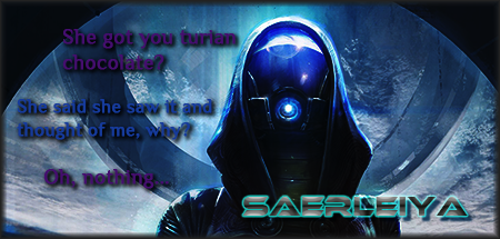
by saerleiya
Thanks Shroob'.
i found the source of quality loss, which is the size recduction of my sig through Paint.net. I wasn't even able to find that you could redim your image with Photoshop before. I'm so dumb...i also removed the blur effect I added for the text before, as it was in fact pretty underwhelming.
Anyway, should be better now. here is the new link :
EDIT : Image has been removed.

Re: Signature/Banner Topic
Posted: Tue Jul 29, 2014 3:53 am
by Shrooblord
It's still very tall, almost obnoxiously so, without trying to sound like a total dick for saying it, sorry. But it needs resizing height-size. Half as tall would be ace, but 2/3rds as tall as it is now is sufficient. But yeah, looks better already!
Re: Signature/Banner Topic
Posted: Tue Jul 29, 2014 4:02 am
by saerleiya
Alright, so the best size here is actually roughly 450x250 pixels. Noted, so I won't have to do it for every other sig XD. Thanks. My main concern is the text, which is maybe a bit too small...
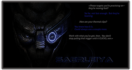
EDIT : The one I talked about a bit before. The text is a part of a dialogue between both characters on the new sigs. I almost uploaded a first version of it, but the colors weren't well balanced finally, so I turned down a bit the brightness curve, darkened the color of my nickname and brightened the other texts.
Re: Signature/Banner Topic
Posted: Tue Jul 29, 2014 5:32 am
by Shrooblord
They both look pretty sweet, but, yeah, if you want people to read the text, I'd brighten the letters up a notch.