How could we improve the portal?
Forum rules
Please keep the forum rules and guidelines in mind when creating or replying to a topic.
Please keep the forum rules and guidelines in mind when creating or replying to a topic.

Re: How could we improve the portal?
I was thinking about your AdSense idea, and I think it might now be a bad idea, but you would have to be careful about how you do it. If it is too obvious it could mess up the feeling and flow of this community. Need to be discrete with it.

Re: How could we improve the portal?
AdSense is a bad idea. And the ads are usually not handy at all. Unless you need the money afcourse. Students have many costs. But then you should place it somewhere where it doesn't bother. Like at the bottom of the page.
-
Hunchman801

- Posts: 87673
- Joined: Thu Aug 07, 2003 6:50 pm
- Location: Paris, France
- Contact:
- Tings: 640477
Re: How could we improve the portal?
I'm afraid it's not possible thoughJman wrote:I really like the idea of a Raytunes player. Maybe like a flash player on the bottom that works from page to page.
It's nice, but there are many useless and redundant features. I don't want the portal to turn into a gadget, it will have to be as useful as possible.Holy Crap wrote:There's all sorts of stuff on this portal which you could consider: http://thenerdsenturage.2ksite.com/portal.php
It even has a top poster list.
A calender of notable dates on PC and birthdays and stuff would be good too.
Jman wrote:I was thinking about your AdSense idea, and I think it might now be a bad idea, but you would have to be careful about how you do it. If it is too obvious it could mess up the feeling and flow of this community. Need to be discrete with it.
We have no problems to finance PC, but it's true that it could help us to organise real competitions. As for the ads, there are many possibilities, and all of them are highly customisable. In fact, I can have them look exactly like the bottom line block, by modifying all the colours and changing the shape of the border. In fact, I remember visiting a Final Fantasy website with both AdSense and eBay blocks perfectly embedded in the portal, and I was surprised how relevant the links were (basically, links to buy the games and other related products through commercial websites or online auctions). If I've added them to the list of ideas, it's because I think they can be interesting for visitors. There could also be the possibility to turn them off for logged in users.Joshua822 wrote:AdSense is a bad idea. And the ads are usually not handy at all. Unless you need the money afcourse. Students have many costs. But then you should place it somewhere where it doesn't bother. Like at the bottom of the page.
Also, I've been thinking of the Hall of Fame block, and I had an idea: what about displaying randomly either the top poster list, the top boon list, the top R3 list, etc.? We just can't put them all on the portal, and I like random things, you may have noticed it with the colour of the RSS icon.

Re: How could we improve the portal?
I've been missing a link back to the portal from the forum as well...
I wouldn't mind some adds here and there, as long as they don't clutter things up... Preferably only text-adds though, no obnoxious banners because they can clash completely with the colour-scheme of the forum...
The Raytunes-player idea sounds nice, but if it stops playing when you leave the portal, I don't really see the use. Then I'd much rather just download the music to my computer, I think.
I really like the calendar idea. This could maybe be fused with the Lights on-idea, displaying some info on events and happenings related to PC, as well as user birthdays and other important dates like... R2 was released today or whatever.
The Raywiki-article idea also sounds good to me.
The personal space-thing strikes me as useless... Custom pictures I can see on my desktop wallpaper and links to places I often visit are conveniently placed in my bookmarks-bar, and I imagine this goes for most people...
Picture of the day might not be so bad, but the pictures should be clickable thumbnails, I think, or they would take up too much space, meaning less place for other things so that these would have to be crammed together, making it all a mess... And pictures also come in different sizes, so the thumbnails should be of a set size like 100x150 or whatever, or these might contribute to making a mess as well...
Affilates-list also sounds good, I think, but then again, it's important what banners to pick so that they don't clash with the colours of the portal.
Rayman 3-hall of fame sounds really nice, if you can manage that... The user-hall of fame sounds like a less good idea, though it would depend on what the listings are created for...
Right now my head is empty and my stomach is full so I can't think of any good ideas... But if I have any, I'll let you know. (:
-
El Dango

- Posts: 12908
- Joined: Thu Feb 28, 2008 8:01 pm
- Location: Where you need me the most
- Contact:
- Tings: 107355
Re: How could we improve the portal?
Dancing bananas! 
Okay, maybe not.
But like the idea with the RayTunes player.
Okay, maybe not.
But like the idea with the RayTunes player.
Re: How could we improve the portal?
@Hunch : Maybe it's possible to make a temporary file that keeps track of where the music was ( what point ) Then, if you go to the next page, the RayTunes player reads the file and starts the music at that point. I don't know if this is possible tough 
Re: How could we improve the portal?
It is possible with frames (but frames are terrible), and flash websites. I have actually seen some intense well working flash forums.
-
Hunchman801
- Posts: 87673
- Joined: Thu Aug 07, 2003 6:50 pm
- Location: Paris, France
- Contact:
- Tings: 640477
Re: How could we improve the portal?
Unfortunately, the music would stop for a split second (or more depending on your connection speed) when the new page is loading. Using frames would be horrible, and I'm afraid there's no other solution. The only possibility is to open the player in a pop-up, but then, what would we put in the box on the portal?Joshua822 wrote:@Hunch : Maybe it's possible to make a temporary file that keeps track of where the music was ( what point ) Then, if you go to the next page, the RayTunes player reads the file and starts the music at that point. I don't know if this is possible tough

Re: How could we improve the portal?
Romano recently worked on blog system, did he speak to you about it, Hunch?
-
Hunchman801
- Posts: 87673
- Joined: Thu Aug 07, 2003 6:50 pm
- Location: Paris, France
- Contact:
- Tings: 640477
Re: How could we improve the portal?
No he didn't, but how could we implement it to the portal? By the way, I have found a nice widget:
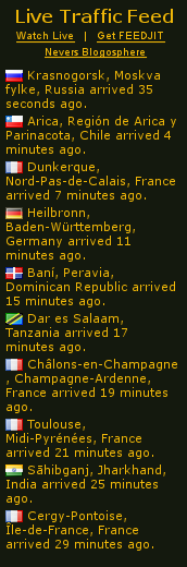
As you can see, it can be easily customised and displays the last visitors and where they come from. Not that it's very useful, but well, it's quite cool ^^
As you can see, it can be easily customised and displays the last visitors and where they come from. Not that it's very useful, but well, it's quite cool ^^
Re: How could we improve the portal?
Yeah, that's actually quite cool, but you should only take the last 3.

Re: How could we improve the portal?
Hunchman, do you know when abouts these alterations will be made? Ideally, I'd like an HOF by the time I finish TBOM. 8)
-
spiraldoor

- Posts: 12392
- Joined: Tue Jul 15, 2008 3:13 pm
- Tings: 156600
Re: How could we improve the portal?
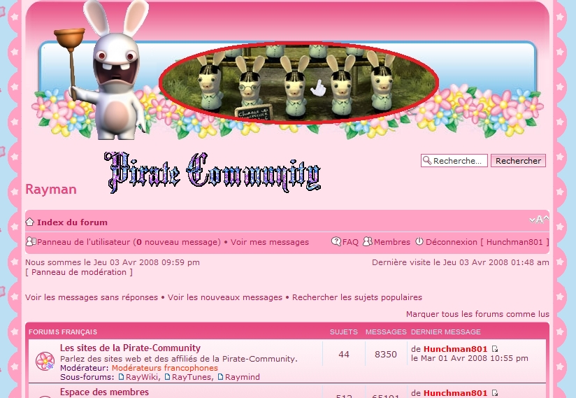
The portal needs redesigning. It is currently confusing. RayWiki, RayTunes and the Forum should be displayed in equal, prominent positions.
I have an idea, don't flame me if you don't like it: I think there should be YouTube videos embedded on the portal. These videos should be Rayman-related, individually selected by moderators, and, with the permission of their uploaders, added to a list of videos, one of which is randomly embedded on the portal whenever someone views it. I've seen similar things on other forums.IT'S JUST AN IDEA.
And I think we should be able to choose to view the site in different themes, another thing I've seen on other sites. The current theme is Prison Ship with Pirate logo; it would be cool if there were several themes to choose between. For example, a Hoodlum theme, or something. This is an extremely bad example of a different theme.
Just ideas...
Re: How could we improve the portal?
I guess it's an interesting thought, but it would take ages to design several different themes.
-
spiraldoor
- Posts: 12392
- Joined: Tue Jul 15, 2008 3:13 pm
- Tings: 156600
Re: How could we improve the portal?
How long did the April Fools theme take to design.
-
Holy Crap

- Posts: 15930
- Joined: Tue Feb 05, 2008 7:54 am
- Location: I AM OMNIPRESENT! (Just like God, only better, because I exist)
- Contact:
- Tings: 80202
Re: How could we improve the portal?
What is up with your sig? 
-
Hunchman801
- Posts: 87673
- Joined: Thu Aug 07, 2003 6:50 pm
- Location: Paris, France
- Contact:
- Tings: 640477
Re: How could we improve the portal?
It may take a while actually. We still have to choose what features we want on the portal, where to place them, and to develop them. Especially for the R3 HoF, which is rather hypothetical in our the current situation.Xenon wrote:Hunchman, do you know when abouts these alterations will be made? Ideally, I'd like an HOF by the time I finish TBOM.
Aren't they already? The forum link is in the left menu, and the links to the PC websites are in the top menu. Maybe you could be more specific...spiraldoor wrote:The portal needs redesigning. It is currently confusing. RayWiki, RayTunes and the Forum should be displayed in equal, prominent positions.
Sounds quite good, but we would need someone to find a new video each day, which is not so obvious after all.spiraldoor wrote:I have an idea, don't flame me if you don't like it: I think there should be YouTube videos embedded on the portal. These videos should be Rayman-related, individually selected by moderators, and, with the permission of their uploaders, added to a list of videos, one of which is randomly embedded on the portal whenever someone views it. I've seen similar things on other forums.IT'S JUST AN IDEA.
Pirate-Community is heavily modified, and it would make it much harder to update several themes at the same time. Not to mention that it would take us ages to create a new theme for PCspiraldoor wrote:And I think we should be able to choose to view the site in different themes, another thing I've seen on other sites. The current theme is Prison Ship with Pirate logo; it would be cool if there were several themes to choose between. For example, a Hoodlum theme, or something. This is an extremely bad example of a different theme.
I don't have a clue, for I'm not the one who made it.spiraldoor wrote:How long did the April Fools theme take to design.
Re: How could we improve the portal?
If we do choose to adopt spiraldoor's suggestion, here's an idea:
There could be three themes: a Rayman 1 based one, a Rayman 2 based one and a Rayman 3 based one. Then, the theme could be changed or switched during the months of the year depending on how long we decide to sustain one theme. For example -
January = R1
February = R2
March = R3
April = R1
May = R2
June = R3
July = R1
August = R2
September = R3
October = R1
November = R2
December = R3
If themes take a long time to create, maybe three separate banners could be used instead...? Hohum, the one gaping problem is the R2 pirate figures are symbolic to the name and logo. Oh well, just sharing a few ideas.
-
spiraldoor
- Posts: 12392
- Joined: Tue Jul 15, 2008 3:13 pm
- Tings: 156600
Re: How could we improve the portal?
The Robo-Pirate logo with "Pirate Community" written around it could be present in every theme. Or different variations of the same logo could be created, with different shape, font, and colours, while maintaining our symbolic pirate logo. Maybe.
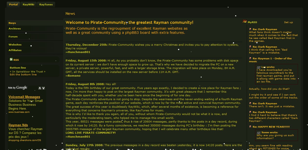
In fact, I'll post a picture of my design. It's VERY rough, though:

That's just to give you a general idea of what I am suggesting.
I don't really like that little menu. I think the links to RayWiki, RayTunes and the Forum should be big. Not just on the left, but across the page, horizontally, in a row. And I think the Forum should be in the middle, RayWiki on the left, and RayTunes on the right. I think they should each have their own logo.Aren't they already? The forum link is in the left menu, and the links to the PC websites are in the top menu. Maybe you could be more specific...
In fact, I'll post a picture of my design. It's VERY rough, though:
That's just to give you a general idea of what I am suggesting.
It wouldn't be too hard. There are hundreds of Rayman videos on YouTube. There are complete walkthroughs for Revolution, R2 DC and R2 PS1, as well as videos people have uploaded of Rayman Desgner levels they've made, tributes to Rayman games etc, and many videos are very interesting indeed. For example, there's this, and this, and this, and this.Sounds quite good, but we would need someone to find a new video each day, which is not so obvious after all.
-
Hunchman801
- Posts: 87673
- Joined: Thu Aug 07, 2003 6:50 pm
- Location: Paris, France
- Contact:
- Tings: 640477
Re: How could we improve the portal?
Huge links are usually ugly and take too much space. I'm not sure whether we should move the forum link to the upper tabs, as they're supposed to be for Pirate-Community websites, but it may be a good idea after all.spiraldoor wrote:
You missed my point. I know there are hundreds of suitable videos, but without someone to take care of the video section daily, there's not much we can do. All we need is a devoted fanspiraldoor wrote:It wouldn't be too hard. There are hundreds of Rayman videos on YouTube. There are complete walkthroughs for Revolution, R2 DC and R2 PS1, as well as videos people have uploaded of Rayman Desgner levels they've made, tributes to Rayman games etc, and many videos are very interesting indeed.Sounds quite good, but we would need someone to find a new video each day, which is not so obvious after all.
By the way, I have tested the Google Ads on the portal, and here's an example of what it may look like.
Now we've gathered a lot of ideas, it may be a good thing to decide which features we really want and where to display them on the portal.