Page 12 of 17
Re: Which box art looks the best? - #29 (GTA III)
Posted: Thu Jan 04, 2024 1:06 am
by lyndo64
Here's another suggestion, why don't we do the orignal SMB?
Re: Which box art looks the best? - #30 (Super Mario Bros)
Posted: Sun Jan 14, 2024 11:59 am
by DaveRattlehead
Sorry for the delay, I was busy with some personal stuff

We have a winner! GTA 3's American Version is your favourite one. In the end, is the one which is the base for GTA's box arts nowadays, so it seems that was a big factor

lyndo64 wrote: Thu Jan 04, 2024 1:06 am
Here's another suggestion, why don't we do the orignal SMB?
Here we go! 
You have to decide between the NTSC-U version and the NTSC-J version (which is very similar to the PAL version, so I haven't included it here). As you can see, they are both pretty different! So... Which one do you prefer? Voting starts now

Re: Which box art looks the best? - #30 (Super Mario Bros)
Posted: Sun Jan 14, 2024 1:09 pm
by Master
Hmm, now this is an interesting one, I know Ninty seemingly had a policy of only using in-game graphics for a while on their old US NES boxes. And I think that artwork is probably the most iconic for it.
...But I think there's a lot more personality and charm to be had with the drawn artwork used in the JP boxart, so...while the US NES boxart is what comes to mind whenever I think of SMB, I think my preference is towards the Japanese boxart.
Re: Which box art looks the best? - #30 (Super Mario Bros)
Posted: Sun Jan 14, 2024 2:44 pm
by Greengoop
I must go the Japanese one, because it’s got a lot of chaos going in which I like, AND Mario isn’t falling into lava

Re: Which box art looks the best? - #30 (Super Mario Bros)
Posted: Sun Jan 14, 2024 3:43 pm
by The Jonster
The US version is realistic when it comes to the actual game and it brings me nostalgia. But I prefer Japanese, the artwork definitely has that charm and cartoonish vibe that I've come to know when it comes to the series. I'm glad though that they did not give Bowser that look in the end though.
Re: Which box art looks the best? - #30 (Super Mario Bros)
Posted: Sun Jan 14, 2024 5:45 pm
by DaveRattlehead
I prefer the Japanese box art too. I think Jonster explained better what I was about to say
Re: Which box art looks the best? - #30 (Super Mario Bros)
Posted: Sun Jan 14, 2024 7:49 pm
by lyndo64
I love how off-model everyone looks like in the Japanese box art
I also think the yellow border goes well with the art.
Re: Which box art looks the best? - #30 (Super Mario Bros)
Posted: Mon Jan 15, 2024 1:45 pm
by Steo
I think I agree with both Master and Jonster on this. The US boxart is iconic and it's what I will always think of and assign to this game, but the JP boxart looks really nice.
Re: Which box art looks the best? - #30 (Super Mario Bros)
Posted: Sat Jan 20, 2024 12:33 pm
by mikemoron
ntsc-j boxart is peak, represents the early days of the series quite nicely
Re: Which box art looks the best? - #31 (Crash Bandicoot)
Posted: Tue Jan 23, 2024 10:00 pm
by DaveRattlehead
So there's an unanimous decision... For all of us, the NTSC-J box art is better than the NTSC-U one! This was kinda surprising, as the NTSC-U box art is probably the one we all know

Now, let's go with another classic game, but in this case from the original PlayStation. Just like Rayman, this character was "abandoned", but the series resurrected after a refreshing remake of the original trilogy. Who doesn't know the most famous bandicoot?
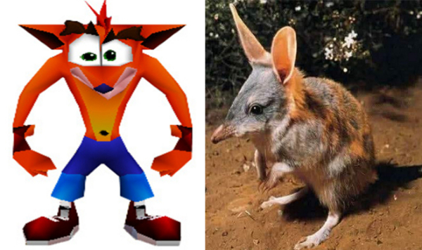
Most of us know the original box art, which is the one released for the NTSC-U and PAL versions. However, the NTSC-J is slightly different.
So, this week's poll is... Which box art do you prefer: the NTSC-U/PAL version or the NTSC-J version?

Re: Which box art looks the best? - #32 (Resident Evil 4)
Posted: Fri Feb 23, 2024 12:54 am
by DaveRattlehead
The results weren't going to change after a month, right?
There's a tie!
Hopefully we'll have a winner this time. This is a classic one and most of you have probably heard about it. Let's see what RaymanPC prefers...
Do you prefer the PAL version or the NTSC-U version of Resident Evil 4? Remember, you can see the box arts in the first post!

Re: Which box art looks the best? - #32 (Resident Evil 4)
Posted: Sat Feb 24, 2024 4:19 pm
by Hunchman801
PAL any time, it leaves a lot more to imagination than its NTSC-U counterpart.
Re: Which box art looks the best? - #32 (Resident Evil 4)
Posted: Sat Feb 24, 2024 6:20 pm
by Elite Piranha
I guess it depends on what you want to achieve. I voted for the NTSC-U cover since it makes more sense to me, it shows the protagonist and one of the main villains. While the PAL cover is more inetersting, it looks like something you would see in the back cover of the manual.
Re: Which box art looks the best? - #32 (Resident Evil 4)
Posted: Sun Feb 25, 2024 12:04 am
by DaveRattlehead
Sure, if you look at it from that point of view, the NTSC-U box art makes more sense. You can see Leon, Bitores Mendez, the Ganado... But dude, even with that it looks terrible for me. I don't know, there's something in that box art which looks weird af and I can't explain it
. Normally I like both options and they have their charm, but I think this time I didn't have to think about it for a second
Re: Which box art looks the best? - #32 (Resident Evil 4)
Posted: Sun Feb 25, 2024 8:33 am
by Elite Piranha
I wonder where the discomfort comes from (the character renders, the color palette or the distribution of the elements).
Re: Which box art looks the best? - #33 (Metal Gear Solid)
Posted: Sun Mar 03, 2024 11:48 pm
by DaveRattlehead
I think it's the distribution of the characters. I'd have to think about it better
The European version takes the win this time!
In this week's poll well vote for two different box arts from another classic game... Lots of nostalgia here
Which box art do you prefer in "Metal Gear Solid": PAL or NTSC? As always, both of them are in the first post

Re: Which box art looks the best? - #33 (Metal Gear Solid)
Posted: Mon Mar 04, 2024 1:49 am
by lyndo64
NTSC for me, I really don't like the reddish metallic look they went for.
Also I have another suggestion, maybe Rayman 2 Forever?
Re: Which box art looks the best? - #33 (Metal Gear Solid)
Posted: Sat Mar 09, 2024 2:04 pm
by Hunchman801
PAL, the other one is just really plain white.
Re: Which box art looks the best? - #33 (Metal Gear Solid)
Posted: Sat Mar 09, 2024 2:23 pm
by Greengoop
I’d call neither particularly good, but at least PAL actually has box art
Re: Which box art looks the best? - #34 (Rayman 2 Forever)
Posted: Tue Apr 02, 2024 10:32 pm
by DaveRattlehead
Results aren't gonna change after a month, right?
lyndo64 wrote: Mon Mar 04, 2024 1:49 am
Also I have another suggestion, maybe Rayman 2 Forever?
Sure
So, which one do you prefer...
PAL or
NTSC-U? Don't get confused with the background!