Page 16 of 17
Re: Which box art looks the best? - #39 (Crash Bash)
Posted: Fri Aug 15, 2025 12:16 am
by DaveRattlehead
Master wrote: Sat Aug 09, 2025 2:28 pm
Showing a bias, but it's one of the more starker differences when it comes to boxart and I suspect not many folks here are too familiar with the game itself so it'd be interesting to hear an outside perspective.
Metroid Prime 3: Corruption.
I'll repeat what I said when we were voting for the Dark Souls II box art. Don't worry about the bias, because we aren't evaluating the game, but a box art! It's just a phot

That said, I like the idea, and I'll update the topic tomorrow (well, technically today...).
Re: Which box art looks the best? - #40 (Metroid Prime 3: Corruption)
Posted: Fri Aug 15, 2025 2:31 pm
by DaveRattlehead
The reminder was useful

Here you have the results from the previous one.
And now it's time to move to the next one, which is a classic series again! Here you have three different alternatives. Have you played this game?

PAL/NTSC-U
NTSC-J
Unused concept by Todd Keller
Re: Which box art looks the best? - #40 (Metroid Prime 3: Corruption)
Posted: Fri Aug 15, 2025 2:35 pm
by Greengoop
My vote is for the PAL/NTSC-U box art.
Re: Which box art looks the best? - #40 (Metroid Prime 3: Corruption)
Posted: Fri Aug 15, 2025 3:11 pm
by DaveRattlehead
I personally prefer the PAL/NTSC-U box art too.
Re: Which box art looks the best? - #40 (Metroid Prime 3: Corruption)
Posted: Fri Aug 15, 2025 3:28 pm
by Rsandee
PAL/NTSC-U > Unused concept art > NTSC-J
Re: Which box art looks the best? - #40 (Metroid Prime 3: Corruption)
Posted: Wed Aug 27, 2025 12:03 am
by DaveRattlehead
I'm not changing the topic (in case some of you still want to vote!), but I think it would be a great idea to suggest a variety of games so we can use one of them for Record Day.
Re: Which box art looks the best? - #40 (Metroid Prime 3: Corruption)
Posted: Thu Aug 28, 2025 4:11 pm
by Rsandee
I suggest The Legend of Zelda: Links Awakening.
PAL:
NTSC-U:
The Japanese box art is the same as the NTSC-U version, just in Japanese (obviously).
There's also the matter of the originals:
PAL/NTSC-U:

NTSC-J:
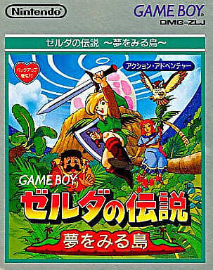
And the DX version on the GBC:
PAL:
NTSC-U:
NTSC-J:
Re: Which box art looks the best? - #40 (Metroid Prime 3: Corruption)
Posted: Thu Aug 28, 2025 4:19 pm
by Greengoop
I’ve never actually seen the PAL Switch edition before. I suppose my copy is an NTSC-U import.
Re: Which box art looks the best? - #40 (Metroid Prime 3: Corruption)
Posted: Thu Aug 28, 2025 4:22 pm
by Rsandee
Actually on a second look, it might have been the concept art and I might have been mistaken on that one.
Re: Which box art looks the best? - #40 (Metroid Prime 3: Corruption)
Posted: Thu Aug 28, 2025 5:49 pm
by RayGamer99
I suggest either Rayman Legends or Rayman (2) Revolution.
Rayman Legends standard art:
(Poor Seabreather... the Definitive Edition is the same, but with a yellow background)
Rayman Legends Japan art:
I find it interesting that this is set in Fiesta de los Muertos (specifically the environment from the Mariachi Madness level), yet the normal art takes place in what I can only guess is Teensies In Trouble.
Rayman 2 Revolution NA art:
This is the box art I grew up with when I played the game - even though I had seen the EU art first thanks to the RayWiki - so it's my personal favorite.
Rayman Revolution EU art:
Is it just me or does Globox look a bit creepy here, lurking in the shadows like that?
Rayman Revolution JP art:
Fun fact: This is the only version of the box art to feature Razorbeard and to not have Ly anywhere.
Re: Which box art looks the best? - #40 (Metroid Prime 3: Corruption)
Posted: Thu Aug 28, 2025 6:42 pm
by Greengoop
I believe Revolution has been done in the past.
Re: Which box art looks the best? - #40 (Metroid Prime 3: Corruption)
Posted: Thu Aug 28, 2025 6:44 pm
by Rsandee
Yeah it was the very first poll.
Can't believe PAL won that vote with 50%, I definitely prefer the green NTSC-U art.
Also you're right, Globox does look creepy! In fact, I've never noticed him before

That creeped me out.
Re: Which box art looks the best? - #40 (Metroid Prime 3: Corruption)
Posted: Thu Aug 28, 2025 6:48 pm
by DaveRattlehead
RayGamer99 wrote: Thu Aug 28, 2025 5:49 pm
I suggest either Rayman Legends or Rayman (2) Revolution.
Rayman Legends standard art:
Rayman_Legends_Box_Art.jpg
(Poor Seabreather... the Definitive Edition is the same, but with a yellow background)
Rayman Legends Japan art:
s-l1200-2.jpg
I find it interesting that this is set in Fiesta de los Muertos (specifically the environment from the Mariachi Madness level), yet the normal art takes place in what I can only guess is Teensies In Trouble.
Rayman 2 Revolution NA art:
Rayman_2_Revolution_(USA_Box_art).jpg
This is the box art I grew up with when I played the game - even though I had seen the EU art first thanks to the RayWiki - so it's my personal favorite.
Rayman Revolution EU art:
RRev_PS2EUcov.jpg
Is it just me or does Globox look a bit creepy here, lurking in the shadows like that?
Rayman Revolution JP art:
Rayman_Revolution_(Japanesse_Box_art).jpg
Fun fact: This is the only version of the box art to feature Razorbeard and to not have Ly anywhere.
Both were done in the past!
Rsandee wrote: Thu Aug 28, 2025 4:11 pm
I suggest The Legend of Zelda: Links Awakening.
PAL:
DzYXEF1UYAYTbYx.png
NTSC-U:
legend-of-zelda-links-awakening-cover.cover_large.jpg
The Japanese box art is the same as the NTSC-U version, just in Japanese (obviously).
There's also the matter of the originals:
PAL/NTSC-U:
NTSC-J:
And the DX version on the GBC:
PAL:
eu.900x.jpg
NTSC-U:
na.900x.jpg
NTSC-J:
jp.900x.jpg
Nice!
Expect changes in the poll soon.
Re: Which box art looks the best? - #40 (Metroid Prime 3: Corruption)
Posted: Thu Aug 28, 2025 7:06 pm
by Dumbo TV
I love link's awakening, still need to finish it but I lost my save raaaaahhhh
Re: Which box art looks the best? - #41 (The Legend of Zelda: Link's Awakening)
Posted: Fri Aug 29, 2025 10:33 pm
by DaveRattlehead
Let's continue with a very popular game series. Here you have a couple of alternatives for The Legend of Zelda: Link's Awakening. Which one do you prefer?
PAL & NTSC-U
NTSC-J
Re: Which box art looks the best? - #41 (The Legend of Zelda: Link's Awakening)
Posted: Fri Aug 29, 2025 10:34 pm
by Greengoop
I love the simplicity yet coolness of the PAL/NTSCU so I’ll go for that one.
Re: Which box art looks the best? - #41 (The Legend of Zelda: Link's Awakening)
Posted: Fri Aug 29, 2025 11:02 pm
by Master
Closing off the Prime 3 poll, I am interested in how folks ended up preferring the US boxart, because it definitely has a greater draw, and yet as someone who's played and beaten Prime 3, I know the JP one feels far more representative.
It's interesting because it just shows how box art isn't necessarily a matter of accuracy, but of draw.
Re: Which box art looks the best? - #41 (The Legend of Zelda: Link's Awakening)
Posted: Fri Aug 29, 2025 11:03 pm
by Rsandee
Going with NTSC-J on this one. I like how you chose those 2 because it's basically the modern minimalist vs the 90s vibrant artstyle.
Re: Which box art looks the best? - #41 (The Legend of Zelda: Link's Awakening)
Posted: Sat Aug 30, 2025 12:04 am
by DaveRattlehead
I love the NTSC-J style!
Master wrote: Fri Aug 29, 2025 11:02 pm
Closing off the Prime 3 poll, I am interested in how folks ended up preferring the US boxart, because it definitely has a greater draw, and yet as someone who's played and beaten Prime 3, I know the JP one feels far more representative.
It's interesting because it just shows how box art isn't necessarily a matter of accuracy, but of draw.
You're gonna laugh at this, but the color reminded me of the horrible DS1 box art, that's why I chose the other one
Re: Which box art looks the best? - #41 (The Legend of Zelda: Link's Awakening)
Posted: Sat Aug 30, 2025 12:11 am
by Master
Haha, I will agree that the composition isn't the most flattering, I wonder how you'd rate it compared to the other Prime games.