Page 168 of 263
Re: Rate that signature!
Posted: Tue Oct 02, 2012 4:12 pm
by Mammothphant 2
RayFan you were right about the size. I changed it. Did my signature remind anyone the Motörhead logo? I made it accidentally like that. XD
Btw Greenbottle, i give 9/10 for your signature. I like how you made it nicely with slapping Globox.
Re: Rate that signature!
Posted: Tue Oct 02, 2012 7:57 pm
by Serza5
7/10. Simple is all I could say about it. Only reason it's as high as 7 is because elephant.
Re: Rate that signature!
Posted: Mon Oct 22, 2012 6:45 am
by Adsolution
10/10 - The six-fingered one is amongst us.
I've got a bit of an upgrade:

This is my old one, for comparison:
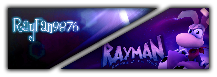
I love the effect I got on Rayman in my current signature.
Re: Rate that signature!
Posted: Mon Oct 22, 2012 7:08 am
by Rendell
RayFan9876 wrote:I've got a bit of an upgrade.
I think, old one looks much better... I would rate old one 10/10, but current - not higher than 6. It looks not bad itself, but if compare with previous it looks worse.
Need to tell, I think your previous signature is the best one I've seen on this forum.
Re: Rate that signature!
Posted: Mon Oct 22, 2012 7:23 am
by Adsolution
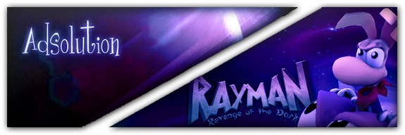
Hmm, you're right now that I look back at it. I let my own vision blind me! Here, it's much more similar to the original now, just a little smaller:
Re: Rate that signature!
Posted: Tue Oct 23, 2012 11:18 pm
by Master
I actually put some effort into this one, though I'm not sure if the results are 100% satisfying, what do you guys think?
Re: Rate that signature!
Posted: Tue Oct 23, 2012 11:19 pm
by Adsolution
9/10 - very nice, but what is that in the middle?
Re: Rate that signature!
Posted: Tue Oct 23, 2012 11:20 pm
by Shrooblord
Yes. I was actually going to post in here as soon as I saw it, disregarding if you were or weren't the person above me, but yes.
I give it a 9.2/10 - of course I'm DW-biased, but I also genuinely really really like it and it suits you well. Great job.
EDIT:
This one's for MasterLyf of course. Adsolution, you have an awesome sig too.
Also: it's a Doctor Who logo but then says 'ML' as opposed to 'DW'.
Re: Rate that signature!
Posted: Tue Oct 23, 2012 11:34 pm
by Master
Adsolution wrote:9/10 - very nice, but what is that in the middle?
It's based off the Doctor Who logo:

In the Middle is "ML" instead of "DW"
Re: Rate that signature!
Posted: Wed Oct 24, 2012 12:41 am
by Serza5
Rating both of ye because I can:
Rayfan : 9.5/10, it's definitely improved from the last but it still holds the same problem that the font for your name doesn't fit.
Master: 8.5/10, pretty sweet but the L in the Tardis is pretty off-putting, and i'm not fond of the colours.

Re: Rate that signature!
Posted: Wed Oct 24, 2012 12:47 am
by Adsolution
Serza5 wrote:Rayfan : 9.5/10, it's definitely improved from the last but it still holds the same problem that the font for your name doesn't fit.
I'm actually really curious about that, what do you suggest for the font? I personally like it, though some people have said it doesn't match the rest of the signature very well.
Re: Rate that signature!
Posted: Wed Oct 24, 2012 3:03 am
by Serza5
I couldn't name you specific ones but i'd try looking for bold fonts, specifically one that's close to the ROTD logo but anything bolder than what you have would at least look better.
Re: Rate that signature!
Posted: Thu Oct 25, 2012 5:15 am
by Keane
oooh Rayfan has a new username.

Re: Rate that signature!
Posted: Thu Oct 25, 2012 9:25 pm
by Bradandez
6.5/10 for Raytunes, because mostly I don't know who the fellow in you signature is, but does have creativity in the background.
And 7/10 for Serza5, mostly because it has a really nice background and such.
Re: Rate that signature!
Posted: Thu Oct 25, 2012 9:26 pm
by Adsolution
8/10 - A little messy (Elem's arm and hand are bugging me), but stylish.
Re: Rate that signature!
Posted: Thu Oct 25, 2012 10:03 pm
by Serza5
Bradandez wrote:
And 7/10 for Serza5, mostly because it has a really nice background and such.
Y only 7 tho?

Re: Rate that signature!
Posted: Fri Oct 26, 2012 1:18 am
by Viricide Filly
6/10 for the fact that it looks nice but I don't know who that is on it ^^
Re: Rate that signature!
Posted: Fri Oct 26, 2012 1:22 am
by Adsolution
Viricide Filly wrote:6/10 for the fact that it looks nice but I don't know who that is on it ^^
it's Lin Bei Fong from Avatar.
(Vote for viricide, not me, this is just an answer post.)
Re: Rate that signature!
Posted: Tue Nov 06, 2012 12:04 am
by Serza5
Viricide Filly wrote:6/10 for the fact that it looks nice but I don't know who that is on it ^^
I don't see why I should be marked down simply because you don't know who the character is? :S
@Viricide Filly: 7/10, it's nice and simple but too simple. The text is pretty darn plain, likewise with the ponies.
EDIT : Rate Wallace bitches
Re: Rate that signature!
Posted: Tue Nov 06, 2012 1:04 am
by Adsolution
8.5/10 - Love the new signature, it's a fruitful successor to your other, but the left side of the image feels slightly empty.