Bradandez wrote:Wind Waker HD looks so beautiful! It looks as if the everything is made out of the smoothest clay. I want to play it so bad.
Ugh, no. I honestly think that they completely ruined it, graphically. There's so much bloom in this remake it makes me keep wanting to clean my glasses because I'm thinking they're smudged constantly, who thought that putting in this much bloom was a good idea? The lack of cel-shading also bothers me, but that's more preference than it is a critical killing of an aesthetic rule of thumb.
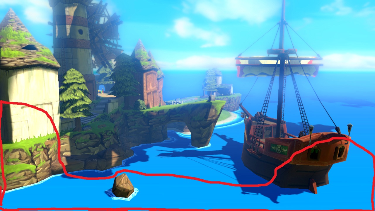
This, and most sunny areas in the game bother my eyes. There's so much bloom from the sky it just bleeds onto everything, fogging it all up. The only part of the image that isn't thickly masked in the bloom from the sky is the part I've outlined in red. Bloom can certainly be done well, of course, it's a technique used to bring warmth to a scene and blend the colours together. This isn't blending though, this is like taking a giant transparent blue overlay and lathering it on the entire image.
I'll take some of Nintendo's own comparison shots as a basis for specific criticism:
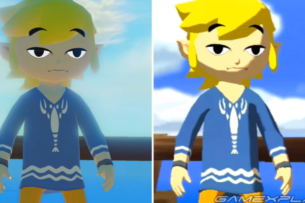
Am I the only one who finds it strange that his face is no longer illuminated here? On the right (GameCube), the Sun lighting is warm without taking over, and the colours all perfectly contrast eachother. The left (Wii U) looks like they forgot that the Sun exists and, obviously, cranked up the bloom so that it covers the entire image, making the main event the sky and not Link. And I'm even one of those people that think Microsoft is being pretentious by ditching a nice UI design (Aero, the thing Vista and 7 had going for them) in place of a flat look almost solely because "it draws users' attention to the main window contents better".
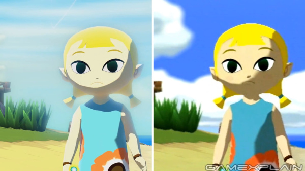
Not only does it look like someone shot this with a far-over-exposed camera causing Aryll's facial features to become almost invisible in the Wii U version, the shadows are also far, far too defined to accommodate the soft, bloomy style they're going for. There's literally no penumbra at all, it's an immediate switch from light to dark. They're even sharper than the original's, which makes artifacts all the more obvious, and actually makes the shadows themselves look like artifacts in the geometry at times. If they wanted to do this, they really could have made the shadows lighter.
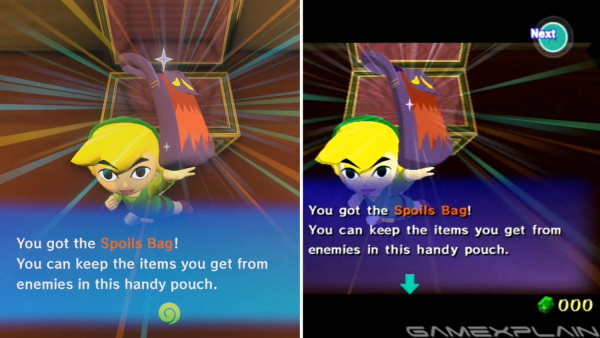
Oh come on, the lighting here is just a joke. Look at the bottom of his hair and face in the Wii U version, that looks like something you'd expect out of an N64 game, and the ground is bright as ass; what is that, rubber? I also don't know what possessed them to make that nice gradient textbox they had in the GC version into such a bright, intrusive turquoise that doesn't mesh with anything in the Wii U version. Link's nose also looks like a pig's. The models were just not designed for this kind of a lighting solution, and they made no effort to fix that. I'd almost say that the Wii U screenshot here looks like an unfinished version of the GameCube scene on the right, as if they're just using some default lambert shader while they're testing out gameplay mechanics. The blending they used on the shine rays also clearly used some kind of color-burn-like blending in the GameCube version so that they wouldn't interfere with the extreme blacks such as Link's pupils, but in the Wii U version, they just seem ordinarily transparent and grey his eyes out, making him look like a lifeless toy as opposed to the lively, animated cartoon he is on the right-hand image.
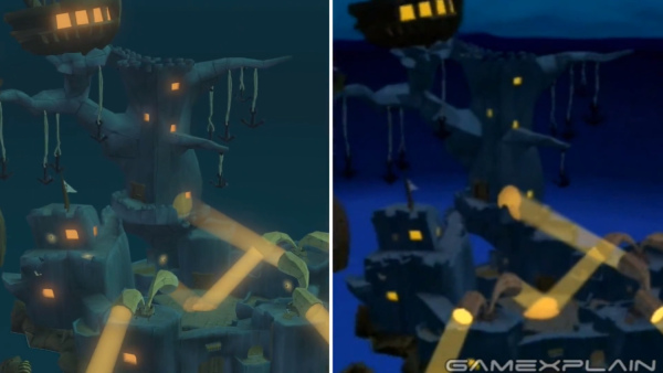
Aesthetically, this one looks okay in the Wii U version. What's wrong then? This is the bloody Forsaken Fortress, they made it look like some peaceful, welcoming enchanted fairy house. The dark colours contrasting with the bright, defined lights and the light-to-dark vertical background gradient in the GameCube version actually make it look like a cold, frightening place. The glowing windows in the Wii U version are almost reminiscent of fireflies, things you don't typically associate with something broodingly industrial. Also, they kind of fucked up the light shader- in the GC, you can clearly see that they lighten everything behind them - in the Wii U, they only lighten the lights behind them, but everything else is dark. That's a nitpick, but it just goes to show how all these various HD ports of games as of late seem to be very sloppily done.
I don't understand why they couldn't have gone through the game and added detail, made things physically better wherever possible. Made better models, better textures, modelled 3D objects in place of where some flat textures were used before, added another level of life to the Wind Waker world. All they did, like with most other recent HD ports, is change the lighting scheme, maybe add one random physical detail in, and throw some filters over top, and in this case, a very shitty one. The vast majority of people in independent game development I've spoken to all agree with me in there being too much bloom, and it being an extremely lazy attempt.
Regarding the removal of the cel-shading (a retarded idea in my opinion, why would they ditch one of the best ideas they've ever had, and the thing that basically defines Wind Waker?), all it did was reveal more flaws. One of the reasons I think the GameCube version looks so much more pristine is, aside from the much, much more refined look of it, the full-on cel-shading actually completely hides all model deficiencies, making it effortlessly look like a beautifully stylised cartoon rather than a video game that was trying to look like a storybook, but gave up a fifth of the way through.
In some places mind you, the HD version does shine, but not often. The original had a very specific style it was going for, and it pulled it off perfectly. This version took a bit of a different route, and while I understand what they were going for, I think they took a wrong turn at the very beginning as to how they should go about getting there. There are other, far better solutions to blend the sea and sky together and make the world glow, but just using bloom is the laziest and worst way you could go about it. I'm not joking, it's beyond amateur, and the results are just morbid. I'm willing to bet that most who disagree think that the current HD version is just fine and can't picture what a more optimal solution would look like. I can assure you, they could have done so much more and so much differently. There is nothing being done in this so-called 'HD' version that couldn't have been done on the GameCube, aside from run in 1080p.
- No, I'm not being some pretentious person who would rather look at technicalities/what the textbook says is the right amount of something instead of looking at it for what it is, or a purist, I was bothered by it the second I laid eyes upon the first official screenshots on Facebook before I even knew I was looking at Wind Waker. Since I've been working with engines for a while now, I know instantly what I'm looking at, likely how it was done, and what they could have done better. In most cases I'm satisfied, but this, along with most HD ports, leave me in shock at how little work was put into them, and how quickly they wanted to shovel out a port to nostalgiafags and newcomers that's just different enough to avoid the virtual console.