Page 260 of 263
Re: Rate that signature!
Posted: Sat Jul 01, 2017 5:31 pm
by Master
Hmm, alright, I've tweaked the background image. Here's where I'm at now:
Attempt 1:

Attempt 2:

Attempt 3:

Re: Rate that signature!
Posted: Sat Jul 01, 2017 5:34 pm
by Ambidextroid
Nice! I'll let someone else chip in if you want more feedback, but it looks good to me.
Re: Rate that signature!
Posted: Sat Jul 01, 2017 6:29 pm
by Ray502
Looks good to me, Master!

9/10.
Re: Rate that signature!
Posted: Sat Jul 01, 2017 8:14 pm
by PluMGMK
The left border of the "T" is still a bit off, but that's a minor thing. I think it looks really nice, and certainly gives off the right aura!
Re: Rate that signature!
Posted: Sun Jul 02, 2017 3:06 pm
by Master
Excellent, I'm getting there then. I made another addition just to complete the Metroid Prime homage aspect:
Attempt 1:
Attempt 2:
Attempt 3:
Attempt 4:

Re: Rate that signature!
Posted: Sun Jul 02, 2017 3:17 pm
by Ambidextroid
The new one's my favorite so far though it does look a little tall, especially on mobile.
Re: Rate that signature!
Posted: Sun Jul 02, 2017 3:18 pm
by Master
Oh no, I intend to have it at a more appropriate size, I just have it larger for now just for the sake of developing it.
Re: Rate that signature!
Posted: Sun Jul 02, 2017 3:36 pm
by Serza5
Yeah the 4th one would be great if it was smaller.
Re: Rate that signature!
Posted: Sun Jul 02, 2017 3:53 pm
by Master
Right, I've resized the circle and tweaked the colours, here's attempt 5:

Re: Rate that signature!
Posted: Sun Jul 02, 2017 5:46 pm
by Serza5
Seems perfect now.
Re: Rate that signature!
Posted: Sun Jul 02, 2017 8:56 pm
by Ray502
Looks awesome!

Re: Rate that signature!
Posted: Mon Jul 03, 2017 2:43 pm
by Master
Well, I think I've got all the feedback I'm going to get, so let's give this new sig a run. And bid farewell to my current sig, which has served me for almost four years:

(Dec 27, 2013 - Jul 03, 2017)
Re: Rate that signature!
Posted: Mon Jul 03, 2017 3:47 pm
by Fifo
Great job, Master!
Re: Rate that signature!
Posted: Sat Jul 08, 2017 9:03 pm
by Adsolution
9.5/10 Master! It's about time, and it looks baller! I like that pattern you have going on in the letters.
Re: Rate that signature!
Posted: Sat Jul 08, 2017 9:50 pm
by Master
Adsolution wrote:9.5/10 Master! It's about time, and it looks baller! I like that pattern you have going on in the letters.
Thanks Ad! I have to admit, your suggestion regarding the Metroid inspired sig was partially the reason why I went for this design. I'm very happy to hear you approve!
Thanks also, Fifo!
Re: Rate that signature!
Posted: Mon Aug 27, 2018 10:51 pm
by Harpic fraîcheur
I thought our newest members would like this thread, I will too as long as it doesn't become a spam fest. By that I mean the feedbacks given to other users' signatures should be of a better quality than what they sometimes were previously, listing both the the ups and downs of signatures would be a good start already!
So what do you think of my new one?
Re: Rate that signature!
Posted: Mon Aug 27, 2018 11:31 pm
by Steo
I love the new one especially because I love the colour green

Green and red also go together quite well and remind me of Christmas

I removed a couple of mine from my rotator because I personally didn't like them.
Re: Rate that signature!
Posted: Tue Aug 28, 2018 12:02 am
by Harpic fraîcheur
I guess
that one is a street fighter or some old fighting game reference: I like this one much, having Globox holding a street light to jump and then punch the pirate while Rayman is coming out of nowhere to kick his ass out is rather funny in my opinion. Also the pixelated filter on the characters make them fit with the background good, well done!
I'm giving you a 7,5/10 for it.
I think it could be improved by reducing the Pirate's life bar and using a more retro font for your username, though that's pretty much it because it looks nice already!
Re: Rate that signature!
Posted: Tue Aug 28, 2018 2:18 am
by Steo
Thanks for the input High Priest. I've amended it and used inspiration from the Streets Of Rage logo. The health bars are for Rayman and Globox (player 1 and 2) but there are yellow health bars in the game for bosses.
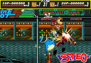
- Streets_Of_Ray_2_Player_Signb.png (152.59 KiB) Viewed 2146 times
Re: Rate that signature!
Posted: Tue Aug 28, 2018 2:22 am
by Harpic fraîcheur
Thanks for telling me! As I basically thought it was a street fighter reference I thought the second life bar was the opponent's. Anyway good job on making this logo, I find it better this way.
That'll be a 8,5/10 now, that's still close to perfection.
