Which box art looks the best? - #42 (Kirby Super Star)
Forum rules
Please keep the forum rules and guidelines in mind when creating or replying to a topic.
Please keep the forum rules and guidelines in mind when creating or replying to a topic.
-
Ray502

- Posts: 12343
- Joined: Tue May 29, 2012 8:15 pm
- Location: Uh, well, I don't really know
- Tings: 52095
Re: Which box art looks the best? [Poll #20]
New poll with Steo's idea is up! 

Re: Which box art looks the best? [Poll #20]
I'm going to go with PAL because I like the way it looks more stealthy. He looks more hidden by the fact that you can just see the light shining up through the grate, showing that he's in a dark area.
I also like the way he's holding the silenced pistol like he's about to take someone out (and no not on a date)
I also like the way he's holding the silenced pistol like he's about to take someone out (and no not on a date)
-
The Jonster
- Posts: 40835
- Joined: Sat Mar 24, 2018 6:15 am
- Location: The realm of Mario Karting
- Tings: 51265
Re: Which box art looks the best? [Poll #20]
Also going for PAL. For the same reasons as him along with the fact that it looks cooler than the other 2.
Re: Which box art looks the best? [Poll #20]
Can this thread cover disc art too or only box art? I think both Rayman 1 (PS1) and Rayman 3 (PS2) discs would be a good one if you can do disc art.

Re: Which box art looks the best? [Poll #20]
I chewed for so much time between the NTSC-J and the PAL versions.
I'm gonna go for the PAL Version, because what Steo said about the cover made a lot of sense for Splinter Cell. I was gonna go for the NSTC-J because how cool he looked with the face shadowed and the goggles(I think that is what they are) Shining on.
But it is supposed to be suggesting "Stealth" so the PAL makes more sense for it.
Trivia- I'm the Fifth voter..
-
Ray502
- Posts: 12343
- Joined: Tue May 29, 2012 8:15 pm
- Location: Uh, well, I don't really know
- Tings: 52095
Re: Which box art looks the best? [Poll #20]
Anyone got ideas for the next poll?

Re: Which box art looks the best? [Poll #20]
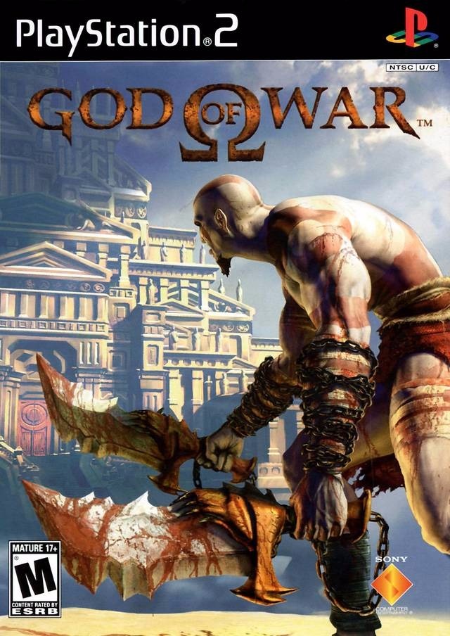
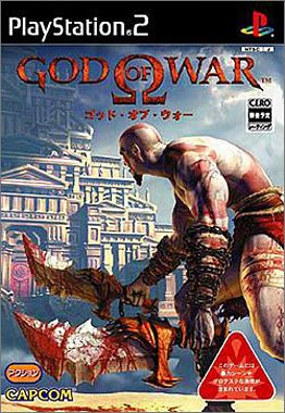
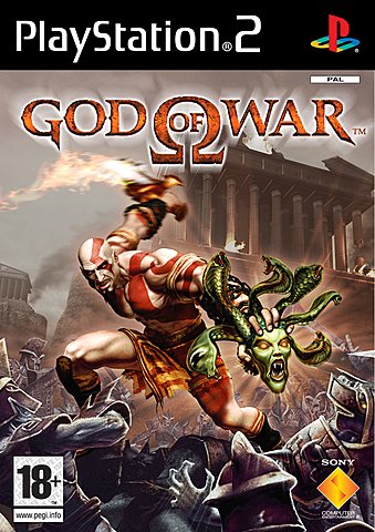
The original God of War had some nifty looking cover art, might be a good pick.
NTSC-U:
NTSC-J:
Pal:
Edit: Also, I voted for the NTSC-J Box Art of Splinter Cell, really enjoy how the light from his night vision goggles covers up his face with light shining behind him.
NTSC-U:
NTSC-J:
Pal:
Edit: Also, I voted for the NTSC-J Box Art of Splinter Cell, really enjoy how the light from his night vision goggles covers up his face with light shining behind him.
Last edited by Greeness on Wed May 30, 2018 2:04 am, edited 1 time in total.
Re: Which box art looks the best? [Poll #20]
Now that you mention it that does look kind of cool compared to the NTSC-U box due to that. I thought they were just identical apart from his head being rotated, but never paid attention to the lighting.
Re: Which box art looks the best? [Poll #20]
I think the lighting is a bit oversaturated with the NTSC-U box art, it also shows a part of his chin which I don't think is very appealing with that model.
-
The Jonster
- Posts: 40835
- Joined: Sat Mar 24, 2018 6:15 am
- Location: The realm of Mario Karting
- Tings: 51265
Re: Which box art looks the best? [Poll #20]
I think this is a good one to use!
-
Ray502
- Posts: 12343
- Joined: Tue May 29, 2012 8:15 pm
- Location: Uh, well, I don't really know
- Tings: 52095
Re: Which box art looks the best? [Poll #21]
Greeness' suggestion is the 21st poll!
-
The Jonster
- Posts: 40835
- Joined: Sat Mar 24, 2018 6:15 am
- Location: The realm of Mario Karting
- Tings: 51265
Re: Which box art looks the best? [Poll #21]
How long does this poll run until? I forgot how long these polls run. (I already voted  )
)

Re: Which box art looks the best? [Poll #21]
I’d love to revive this topic/poll. Anyone who agrees?
Re: Which box art looks the best? [Poll #21]
I blame Jonster for asking an obvious question, which is why nobody replied. 
But yeah, in all seriousness, we really should revive it. I think it was around the time 3 mods left and then it was just forgotten about, since Ray502 was in charge of it.
But yeah, in all seriousness, we really should revive it. I think it was around the time 3 mods left and then it was just forgotten about, since Ray502 was in charge of it.
Re: Which box art looks the best? [Poll #21]
I think we should revive this again. I updated the first post to say that God of War PAL won, albeit 14 months later.
I noticed Beyond Good & Evil was never done, so I'm going to go with that and see how it goes!
I noticed Beyond Good & Evil was never done, so I'm going to go with that and see how it goes!
Re: Which box art looks the best? [Poll #21]
I vote NTSC-U. There is something about the way everything is showing out in that cover art that makes me think of a nostalgiac PS1 fighting game for teens.

Re: Which box art looks the best? [Poll #21]
In my opinion, NTSC-U looks the best because it represents exactly what you do in-game the best and the game overall the best.
Re: Which box art looks the best? [Poll #22]
I had forgotten to update the topic title to say Poll# 22. 
Anyway, I also vote for NTSC-U myself. It just looks much better to me.
Anyway, I also vote for NTSC-U myself. It just looks much better to me.

Re: Which box art looks the best? [Poll #22]
I gave the NTSC-U box art a vote too! 

Re: Which box art looks the best? [Poll #22]
It's nice that the thread is getting some activity since reviving it, and it seems like NTSC-U is going to whitewash the PAL artwork here so far. If anyone has any suggestions for the next poll in advance, please don't hesitate to post them.