
SilverLum wrote: Tue Oct 21, 2025 8:44 pm I think what I love about the Pirate Community is that it is filled with people who remember fondly the original identity of the series. It's comforting how you can talk about the first three games as if they released yesterday, and will be met with just as much enthusiasm as when they first came out. A really special website, this is.

Agreed!
Sure I began with Rayman Arena and then Rayman 3 shortly thereafter, I still quite enjoyed playing Rayman 2. Despite the difficulty level of Rayman 1, it's certainly a beautiful game and they all have something you can simply admire and appreciate.
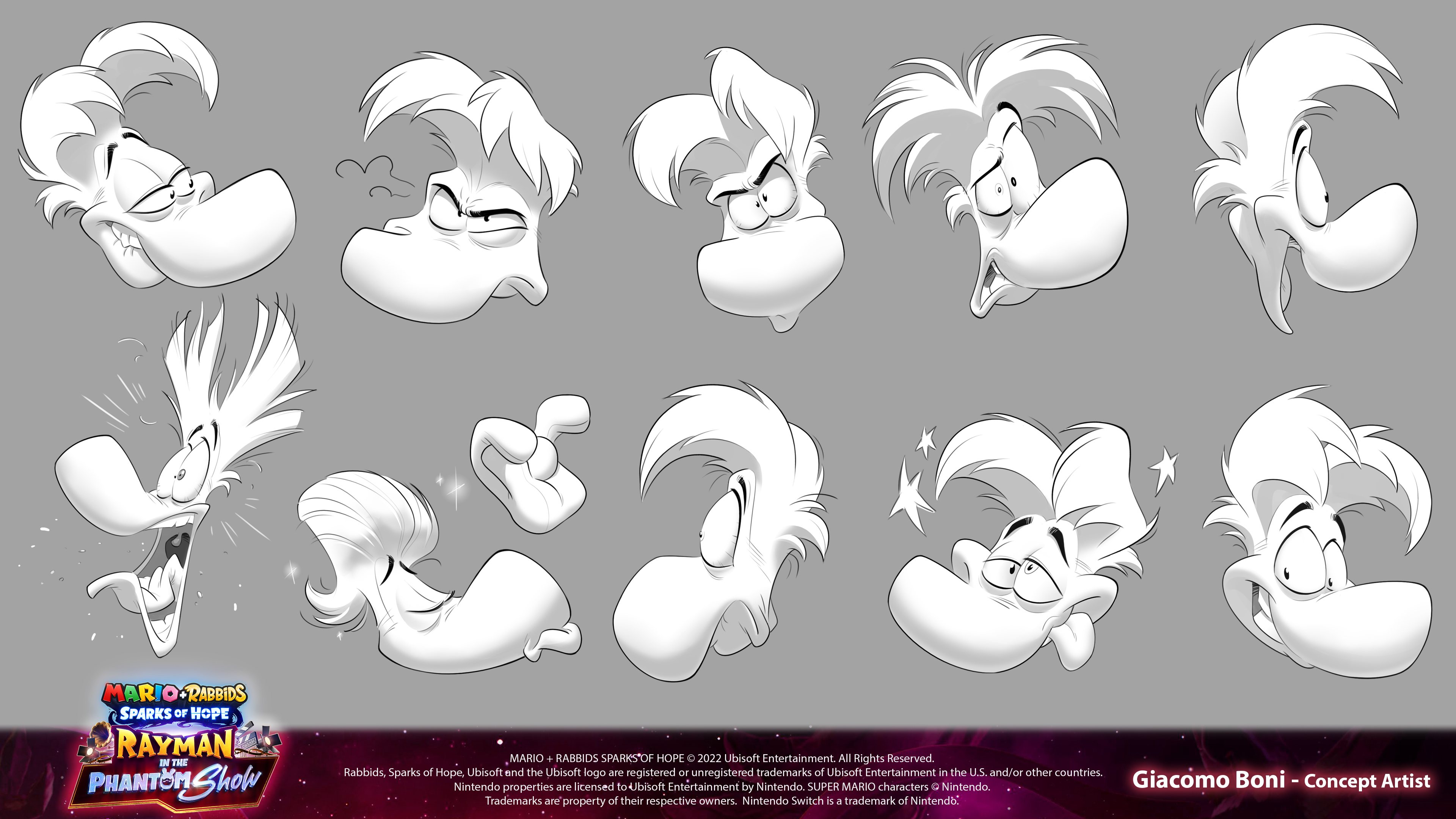
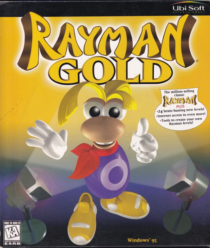
You know... the art work presented here of Rayman I do like, actually.Steo wrote: Wed Oct 22, 2025 9:20 am I personally feel like after Rayman 3, they should have went back towards the Rayman 2 design again, giving him back his scarf and trying to base future models from this one. I know it's probably still a matter of preference to some extent, but I can't personally look at this model compared to the Rayman 2 model, and say that I like it:
Too many random details that are just not needed, the aforementioned cheese hair, the tiny pocket that his hands are too big to fit into, and he now has brown eyes? It could be just me, but I'm not a fan of any of these modern 3D models they've used for Rayman. They had it perfect at 2, and they also did a good job with 3. That's how I feel about it anyway. 3D models should be based more on what 2 was than having random UbiArt elements thrown in really. They are definitely deviating far too much from Rayman's roots for me.
___
That said, the artbook itself still looks cool for what it is, but I'd like to see something that provides elements from the first 3 games more often in general.


