Acarr: Yes they are. Mr Dark's cloak is meant to be a bright and vivid blue; the inside of his cloak and the band around his hat are meant to be a contrasting pinkish-purple colour. In the Rayman Junior intro his cloak is a flat and lifeless purple and the other colours are a bright and ugly pink. Also, notice the far superior quality of the drawing itself (the folds in the cloak). And compare the shading on both of them.
He's just so much better in R1.
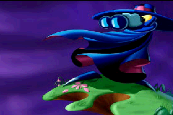
This one is the best image of Mr Dark in existence, and should be used for the rank:
I would rather have had this one as the Mr. Dark avatar. It's a shame it's so wide...
Whenever I see that image, I always feel as if the large black fold in the cloak is his mouth, and that he's a sort of giant walking head thing like Pac-Man. This impression has been ingrained in my mind for years; I have no idea why.
~Does the image of Mr Dark fighting Betilla show Mr Dark's mouth? I like to think that it does.
spiraldoor wrote:Whenever I see that image, I always feel as if the large black fold in the cloak is his mouth, and that he's a sort of giant walking head thing like Pac-Man. This impression has been ingrained in my mind for years; I have no idea why.
I used to think that too. ^^ And it's only recently where I've realised that the sprite for Mr Dark in the GBC game, that his hat with bobbles arn't arms... unlike I used to believe.