Rayman 3
Forum rules
Please keep the forum rules and guidelines in mind when creating or replying to a topic.
Please keep the forum rules and guidelines in mind when creating or replying to a topic.

Re: Rayman 3
Not bad. 
-
Master

- Posts: 53544
- Joined: Sun Aug 21, 2011 10:14 am
- Location: Somewhere specific, I'd assume.
- Tings: 468320
Re: Rayman 3
Personally, it looks ok, but the extreme colourfulness of the logo and Origins' Rayman kindof clashes with the more refined mysticism and toned down colours in the Hall of Doors.
-
Adsolution

- Posts: 22233
- Joined: Sat Aug 22, 2009 4:55 pm
- Contact:
- Tings: 110541
Re: Rayman 3
A subtle jab Master, I like it. But the logo, while by any means okay, indeed could use work. I would suggest using a Rayman 2 Rayman if anything.
I'll give making one a try as soon as I get home.
I'll give making one a try as soon as I get home.
Re: Rayman 3
Yeah,it is not very good.
Just gave it a try.
Just gave it a try.
-
Robotic Teensie

- Posts: 407
- Joined: Thu Aug 23, 2012 12:43 pm
- Location: Unknown
- Tings: 3130
Re: Rayman 3
Your logo is not bad! I like the floppy disk Rayman. In my opinion those letters don't really fit though. Maybe something like the Rayman Origins font would be better. However the logo doesn't fit with the background too well, like the others said.
It did give me an idea... maybe it would be cool if the banner changed depending on the game you selected? The Hall of Doors would be the background for the R2 banner; floppy disk Rayman could be for Rayman Origins with part of Origins' world map as the background, etc. But then I would need a lot of banners, one for each game... if you think it's a good idea I'll make more backgrounds you guys can use.
Anyway, I look forward to your creation Ad!
I didn't have a lot of time to work on RaySaves today... I'm going to write descriptions for each level part now...
-
sergiomonty

- Posts: 3730
- Joined: Thu Jun 16, 2011 10:21 pm
- Tings: 10
Re: Rayman 3
Hm, something in the logo doesn't work... I think it's the background that doesn't mix up properly with the bright colours.
-
Shrooblord

- Posts: 15762
- Joined: Tue Sep 07, 2010 5:07 pm
- Location: The Buccaneer MK. II
- Tings: 68850
Re: Rayman 3
I think this'd work for R2:
http://www.rayman-fanpage.de/rayman2/ra ... enting.jpg
http://www.rayman-fanpage.de/rayman2/ra ... enting.jpg
-
Adsolution
- Posts: 22233
- Joined: Sat Aug 22, 2009 4:55 pm
- Contact:
- Tings: 110541
Re: Rayman 3
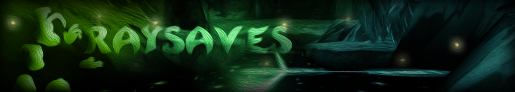
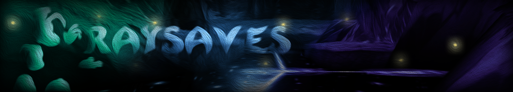
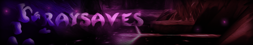
I tried something out, and I made three colour variants of it. Let me know if it's too overstylised...
-
Shrooblord
- Posts: 15762
- Joined: Tue Sep 07, 2010 5:07 pm
- Location: The Buccaneer MK. II
- Tings: 68850
Re: Rayman 3
I like the purple one best. They look cool! Kinda abstract, but still 'there'.
-
Rayfist

- Posts: 12553
- Joined: Wed Jul 07, 2010 8:36 pm
- Location: Right here, right now!
- Tings: 176605
Re: Rayman 3
Wow very beautiful. I have no complaints here really.
-
Robotic Teensie
- Posts: 407
- Joined: Thu Aug 23, 2012 12:43 pm
- Location: Unknown
- Tings: 3130
Re: Rayman 3
Looks good! It has a unique artstyle and nice colours. But maybe it's a bit too... I don't know, dreamlike? It has a strange hypnotic quality... 0.0
I finally got the screenshots part to work, and I finished the first level sub-page (the download buttons are not functional yet though). Now I can copy all the HTML code and reuse it for the other levels! I will need to do a lot of resizing and renaming images and I still need to write many descriptions, but now I can be sure the layout will work.
I finally got the screenshots part to work, and I finished the first level sub-page (the download buttons are not functional yet though). Now I can copy all the HTML code and reuse it for the other levels! I will need to do a lot of resizing and renaming images and I still need to write many descriptions, but now I can be sure the layout will work.
Re: Rayman 3
Purpel is best, in my opinion.

Re: Rayman 3
I also think that the purple one looks the best.
-
Master
- Posts: 53544
- Joined: Sun Aug 21, 2011 10:14 am
- Location: Somewhere specific, I'd assume.
- Tings: 468320
Re: Rayman 3
I like the blue one for some odd reason, the purple one does indeed look good too.
-
Adsolution
- Posts: 22233
- Joined: Sat Aug 22, 2009 4:55 pm
- Contact:
- Tings: 110541
Re: Rayman 3
The blue one was actually the original, and I hue-shifted the others. The fireflies were separate though, as you'll notice in both the blue and green one they're the same colour. Unfortunately, yellow doesn't look so good on top of purple.
Is this something I should fix? If so, what should I change?Robotic Teensie wrote:But maybe it's a bit too... I don't know, dreamlike?
-
Robotic Teensie
- Posts: 407
- Joined: Thu Aug 23, 2012 12:43 pm
- Location: Unknown
- Tings: 3130
Re: Rayman 3
Your banner is beautiful but it has a sort of oil painting style - I wasn't sure if it would make a good website header. However I just tested it on the website and I'm impressed. I'll certainly use it. I think I can set up the page to select a colour variant at random.
I have an idea for a header too and I'd like to use that floppy disk Rayman but it's a shame his hair is cut off. Do you have a complete image TFDs39?
EDIT: After adding the second level page it has become apparent the screenshot thing breaks when you select a different level...
I'll have to fix that or leave it out altogether :/
EDIT 2: I solved it
EDIT 3: Finished all level sub-pages. Almost done! Now I'm going to make the (temporary, to be changed when other Rayman games are added) front page, optimize the site's performance, do a tiny bit of housekeeping (for example I need an icon for the site) and find a web host.
Re: Rayman 3
ekh
-
Adsolution
- Posts: 22233
- Joined: Sat Aug 22, 2009 4:55 pm
- Contact:
- Tings: 110541
Re: Rayman 3
It's better I think, but you need to make use of different blending effects, and some shadows to make the text more immediately readable would be good. Also, I'm not sure why, but you seem to have impossibly ignored every bit of criticism offered, even after replying to them.
-
Robotic Teensie
- Posts: 407
- Joined: Thu Aug 23, 2012 12:43 pm
- Location: Unknown
- Tings: 3130
Re: Rayman 3
It's indeed better, but Rayman is in a strange position. I think it's better when his head/hands/feet are not cut off at the edge of the logo. Also, like Ad said, the text is a bit hard to read (it's better than in the previous logo though). Above all, the logo doesn't really fit with the background...
I like that save icon Rayman, because it doesn't fit with this background I wanted to do a Origins style logo myself, but with a different background - this one isn't really suitable for a Rayman image from Origins I think. Therefore I asked you if you could provide a complete image of that Rayman in the first logo... making a new logo is cool but I still don't have that Rayman image. You see, I can't use the Rayman in the logo you made because his hair is cut off.
I finished the front page (note: it's a temporary one because currently only the R3 part is online), and I'm setting up the download buttons now. I really need to know if this link initiates a download for you:
https://dl.dropboxusercontent.com/s/vv6 ... VFWgQ&dl=1
Could you please click on that link? Tell me what happens - a savegame download is supposed to start, but I don't know if it works for other users.