Adsolution wrote:Take this for instance, a pretty staple shot of Sonic's style:
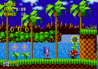
There's no blend to the hues, it's all so harsh and contrasted. The main thing that actually bugs me about this shot is the very dark blue sky, in fact, I'd almost compare the colour scheme to something thrown together in MS Paint. Whether that's a valid piece of criticism or not doesn't matter (as clearly a lot of people do like it), that's just what I think of when I see it.
I agree. Definitely not the best looking, although I love the look of the leaves on those palm trees - it's also not the best, considering the fact that the leaves look like folded pieces of paper but I like it. What I hate the most would be that very dark blue sky - it's too indescribable to explain why I hate it so much.
Adsolution wrote:
It's almost as if you think that the majority of people that don't like something have only been exposed to it through a skewed mindset, which much more often than not isn't actually the reality.
That's not true at all, I just happen to be surrounded by a lot of close-minded people who judge something before actually trying it here.
Adsolution wrote:
@Long paragraph:
Basically, though the same thing had pretty much been said word-for-word by Serza just beforehand. As for A Clockwork Orange, I'd really recommend giving it a full watch. It's one unique work of art that you've doubtfully seen anything like in the past, and it's something you won't ever forget.
I'm certainly going to watch the full movie one day because the plot of it interests me a lot. Plus, I've seen a few copies of A Clockwork Orange on DVD in one of the local vintage stores here and I could always buy it, but I prefer to see at least most of a movie instead of just randomly buying a movie on DVD like most people. I might even read the book one day if I ever happen to find it - but that's unlikely because I usually can't concentrate enough to read books.
Rayfist wrote:
Hm, good point. I guess that's just preference. Though I can't imagine something like that thrown in MS paint and if it were I'd be pretty amazed, check out maybe some of the other games. Not all levels are that bright. Adventurous huh? You may like Sonic Adventure 1 if that's what you're looking for in a Sonic game. But I totally see what you mean, green hill zone does look a bit unappealing to the eye.
I'm glad you have bright thoughts on Lost Worlds, this is exactly what I mean when I tell people Sonic does have good moments, and I wish some people will give it a shot. I'm hoping you manage to pick up Lost Worlds someday, as it looks very good.
Oh also when I was referring to people judging Sonic harshly too much just by looking at the fanbase I wasn't referring to you Ad.
I'm referring to some of my friends who go "bah the whole Sonic series sucks"
Well, I don't know if someone can make anything that complicated in MS paint, but there's bound to be someone out there who can...All in all, Ad was just making a point and it does kind of look like some high-grade piece of MS paint work. However that's just it - it's only high-grade if you think of it as being made in MS paint. It obviously looks a lot better than plenty of other 2D games though. Rayman 1 is basically the point in which 2D games started to actually look very good, though.
Also, I can relate to those last two sentences. People have judged things in that style before a lot, in my experience. But no, that's not always the case.


")
