
I'm having a bit of trouble right now, as it's difficult to design a logo for a company that doesn't exist or doesn't have a name (as most companies design their logos around the kind of products they provide, as well as whatever "personality" they have).
I've been reading a lot of articles about game company logos specifically, and honestly, the majority of them come across as "I played this game the other day and it was made by this company so it's my favourite logo", rather than actually saying anything insightful.
So partly for fun, and partly in the name of research, what are your favourite logos for video game companies (developer or publisher), and why are they your favourites?
Here are some examples of my favourites, off the top of my head (click on the company names if you need to see the logo):
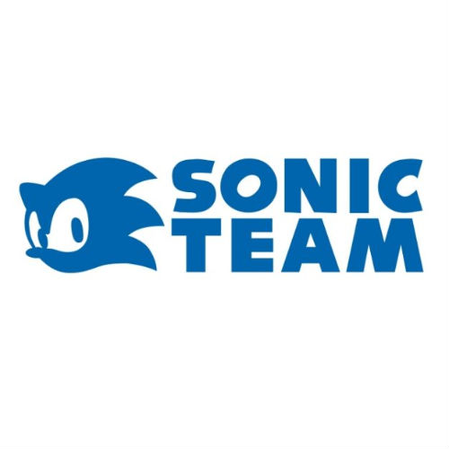
Sonic Team/Sega
First of, before someone says it, this has absolutely nothing to do with me being a huge Sonic fan.
In all seriousness, the Sega logo has always been a favourite, more so in recent years, because of how much it stands out. In the modern gaming industry, we have a lot of companies that have logos that use very modern or sci-fi fonts. The Sega logo stands out to me in these times because of how vintage and groovy it looks in comparison, and I think that brilliantly reflects the energetic, crazy, and cheesy nature of the majority of Sega IPs.
As a subsidiary of Sega, the Sonic Team logo is also a favourite not because it has the face of one of my favourite game characters on it, but because even if Sonic wasn't a recognised character and was used only for that logo, it'd still look as cool as it does now. Having a silohuette of Sonic's face instead of actual artwork makes it cool because it looks a bit more sleek and edgy, and if Sonic wasn't a recognised character, it would add a more mysterious element to the logo, and make you think "I wonder what that charcater would actually look like in full detail". But as Sonic is a recognised character, it gives that "oh, I know that face!" feeling whenever you see the logo. I also like how this logo fits into pretty much any game just fine, or onto any object, making it great easter egg material.
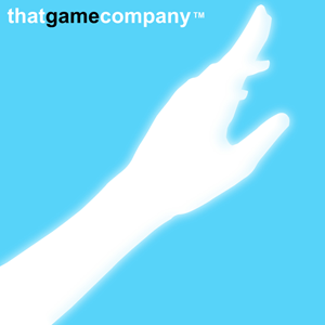
thatgamecompany
I love this logo because it's every bit as evocative and inspiring as any of thatgamecompany's games. When I play, or even look at a game made by them, I get filled with a sense of wonder and awe, feeling that there is a lot to be explored within the game world, and within my own mind, as questions and thoughts race through my mind as I process the work of art I'm experiencing. I get that exact same feeling when I just look at this logo - I have to wonder what that hand is reaching out for, who's hand it is (literally or symbolically), where they are, and so on and so forth.
However, I also find the symbol of the hand reaching out to represent the very essence of their games - all of their games focus on the player's emotional connection between themselves, and something in the game world (Journey does this ten-fold, by literally making you feel emotionally connected to other players whom you have never met before in your life).
Also, that use of sky blue and white is beautiful. The colours contrast and blend at the same time, which is just mind boggling. I also love how the word "game" in the company name is written in black, because it makes sure to remind us that they know they are developing games, and therefore, they need to exploit the advantages of this interactive medium to create the impact their games do, rather than relying on fancy cinematics and black-and-white story telling to keep a player intrigued.
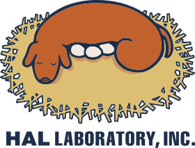
HAL Laboratory
I really like this one because of it's warm, cozy, family friendly feeling, that reflects the spirit of many of the games they work on (OK, so Super Smash Bros isn't exactly warm and cozy, and it's arguably the biggest IP they've worked on, but it is a perfect game for the family). And the dog sleeping on top of eggs within a nest is a fascinating imagery, that to this day, I still can't put my finger on exactly what it means. And I don't think I even want to know, because it's mysteriousness and room for interpretation is part of it's charm. That, and it looks absolutely adorable, much like a Kirby game!
Naughty Dog
My reason for this one is much simpler than the previous ones - it just has attitude. Like all of Naughty Dog's games, really. Even in The Last of Us (from what I've seen of it), the charcaters don't seem overly broody, they still seem charming and at times, have attitude.
I also think the red paw print being in between the black and white text and background leaves a lasting impression. It's very "in your face". Again, much like their games. There really isn't a lot to say on this one. I guess you could just say it's "simply awesome" - again, like their games!
---
I think I'll leave it at that for now. So what are your favourites?


 's logo is my favorite!
