Rayman1 - World map!!!

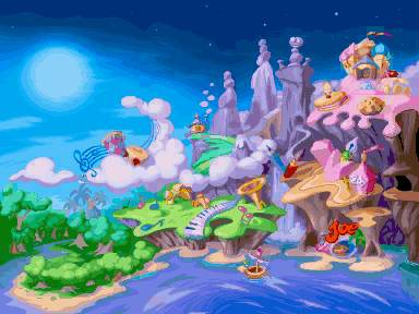
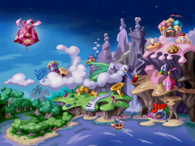
Chacanger – I have replaced the official part of your map with the version from R1 PS1. It has superior colours to the version from R1 PC, as you can see:

MegaMap.png


I’m not sure if it will be possible to use the better version in the game or not.

Your expanded map is very good, but it needs more work. The pine forests and icy mountains don’t look very interesting (and they’re kind of jarring when you compare them to the more cartoonish Dream Forest and Blue Mountains), and the way the new worlds fit together is kind of hit-or-miss (some joints look organic, some look unnatural). I also think you should try fitting your worlds more closely together; the official map has more worlds that your expansion does, and it fits them into half the space. Placing the fantastical toy world between the pine forest and the ice mountains, for example, would break up the monotony of having two realistic worlds side-by-side (much like Band Land did), and would allow you to remove the uninteresting area immediately surrounding the toy world as it is now. Also, it would be cool if you made the right side of your map join up with the left side of the official map, so that Rayman could travel right around the island (and get from one end to the other much more quickly and efficiently).
 
Well, to be honest, I only drew it as a kind of joke to see what it would look like. I wasn't being to serious about it. I knew the size was a lot bigger too. I could use the superior version but then I would also need to redo my backgrounds to Parallax and I would need to increase ever other object to 64k colour from it's current 256 colours. I may reconsider it later but for the moment, I'm going to keep it. Also for the efficient access thing, I'm going to add warp medallions on the map which allow you to teleport to certain parts easier. :roll: :wink:
 
A while back I made like High-res version of this
rayman_world_map_by_imco97-d6iex4y.png
 
It is indeed a very nice rendition, though I'm also going to be a bit nitpicky and say that it looks a little...blurred, I don't know, but I personally think some edges could do with a bit of sharpening.
 
Master said:
It is indeed a very nice rendition, though I'm also going to be a bit nitpicky and say that it looks a little...blurred, I don't know, but I personally think some edges could do with a bit of sharpening.
Yeah, you're right, but on the other hand, this was my very first Photoshop project, so I'm pretty proud of it ;)
 
Indeed, make no mistake, I think it's very well done indeed, I'm merely offering a suggestion.
 
Master said:
It is indeed a very nice rendition, though I'm also going to be a bit nitpicky and say that it looks a little...blurred, I don't know, but I personally think some edges could do with a bit of sharpening.

I must agree with Master. It should be a little more polished.
 
Back
Top