Rayman 3D

Electoon said:
Oh and I first saw the Playstation 1 game when I was little, which in retrospect is probably the worst port. I've more recently seen the N64 version and think it's much better.

The Playstation 1 version has got interesting differences, including the Antitoon cameo, but still it isn't the best Rayman 2: The Great Escape version.

I definitely recommend you to play the SEGA Dreamcast version of Rayman 2.
 
Electoon said:
Rayman 3 annoyed me further because they made Rayman look really stupid and gave him a hoodie.
"Look really stupid"? Seriously?

I found it to be a major upgrade, for several different reasons. The old design was good and all, but very simplistic, and didn't work out as well in 3D. It's justified in R2 because of the technology back then, of course, but I think the change was welcome.

Haruka said:
I prefer the Rayman 2 design.
Your rank says otherwise. :mrgreen:


Anyway, I'm actually surprised that we don't have more hardcore R1 fans here, considering that game's popularity.
 
El Dango said:
Haruka said:
I prefer the Rayman 2 design.
Your rank says otherwise. :mrgreen:

A rank doesn't define my preferences.

I'm still protesting about the RPC's Rayman 2 rank that should be changed to the original one from RaymanZone, for several reasons.
 
RayFan9876 said:
I understand where Electoon is coming from, it didn't seem bright enough. It seemed to dull, dark, and serious.
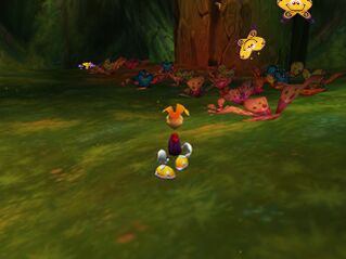
319px-TheWoodsOfLightButterfliesDC.jpg

Really? The game is bright and colourful, not ‘dull and dark’. What makes you think it’s ‘too serious’? Do you really think Rayman 2’s serious story damages it?

Sabertooth1000000000 said:
Did I ever say that it looked good? Also the logo, however bland, isn't that terrible.
I said that it was terrible compared to the original Rayman 2 logo. Taken on its own it’s merely mediocre.

Sabertooth1000000000 said:
Yes. Like I said, the cover art isn't important with ports, and it's new. There's no harm in that. The old artwork is still out there.
Rayman 3D will be eternally associated with this ugly artwork. New players may even think that this is the definitive Rayman 2 cover. The existence of this artwork is unfortunate... I’d have preferred all versions of the game to have good covers, but now it won’t be so.

syntheticgerbil said:
I'm with you. While I had played and finished the first Rayman fully before Rayman 2 ever came out, I wasn't convinced I was that into the game as the tone and art was a little strange and conflicting to me (still is). I felt like the first Rayman couldn't figure out if it wanted to be a cutesy game for kids because of the first few levels and music while the game tended to be way too hard for any younger kid to ever finish. All of the enemy designs outside of the bosses also weren't very inspired.
I don’t see why the game needs to fit into pre-defined pigeonholes of demographics or difficulty levels. Rayman 1 has childish graphics, is intensely difficult and has one of the strangest atmospheres of anything I’ve ever played. It is its own thing. I doubt that it would have remained as popular as it currently is if it had been just another normal game.
 
spiraldoor said:
I doubt that it would have remained as popular as it currently is if it had been just another normal game.

Like keeping Rayman's limbs and the story being all about the Jimmy kid that got teleported into a world inside the computer?
 
Thanks, I know that. It hasn't stopped several members from changing their ranks by donating to a secondary account.
 
Rayman 1 wasn't the only game to have a cake level though. ;P

Rayman 2 is anything but dark and dull for the most part, if anything just the art design alone does a good job at masking what could easily be a blocky game [trust me you all should try a cheat that takes off the textures it's pretty psycho]. But it's your opinion so fair do's.
 
I didn't say it is dark and dull. I thought I made it clear that I said it was when being compared to the first or third games which had very saturated and extremely colorful themes, much mores in the first one. In general, the Rayman 2 is way more colorful than most games out there, but when you compare it to 1 and 3....

Remember, dark and dull isn't a bad thing, even if it sounds like it. By dull I jut mean less variation in colour tones etc. Like I said, Electoon probably prefers the bright, more abstract themes in a Rayman game which Rayman 1 is full of.
 
with Rayman 2 the plot was good (and longer then R3) but there was some 'nightmare fuel' spots. but the game wasn't 'morbid' or 'dark' in terms. it's still bright and full of life and color plus if it was 'dark' I would be throwing my DS against a wall or do in a dark corner to play it.

heck im doing a comic plot where Rayman returns and notices that the glade of dreams after 7 years doesn't look so happy-go-lucky and that they're havoc everywhere while some people are fending themselves from enemies that have ruled the glade with an iron fist. (plus the art wouldnt be cartoony looking, the characters (except rayman) would look like something that came out of American McGee. )


ANYWAYS BACK ON TOPIC:

the boxart for the game looks horrifying 8C the mouth is bothering me to hell it looks like he's wearing lipstick D8 and he reminds me of the 'filechio'(SP?) cheese sticks they sell in america :fou:
 
Sabertooth1000000000 said:
The American box art kind of reminds me of this Japanese art for one of the Spyro games.

spyrocoverjp.jpg.png

Creepy. Spyro looks more wierd there than in the covers I know.
 
Just went in GAME and saw placeholder boxes in the forthcoming 3DS section so it's definitely DEFINITELY gonna be a launch title. Can afford the 3DS but not sure if I'm gonna buy one straight away.

The back cover has an unintentionally funny screeenshot on it which makes Rayman look like he as a fat face. :)
 
I still don't see direct announcements of 3DS Pre-Orders in Portuguese stores but I'm sure that soon they will start to appear.

I'm interested in the 3DS but I won't buy it in the release. I'll try to wait for my b-day, or until Christmas. I will try to get Rayman 3D at the same time as the console.
 
Haruka said:
Sabertooth1000000000 said:
The American box art kind of reminds me of this Japanese art for one of the Spyro games.

spyrocoverjp.jpg.png

Creepy. Spyro looks more wierd there than in the covers I know.
Really? I think Spyro looked better in the Japanese artwork. The manuals over there were even made to be like fairytale storybooks which was awesome. They tried to make Spyro seem 'badass' in the marketing for our versions, and that seems more creepy to me!

Anyway if I haven't mentioned it before, I actually like the American Rayman 3D cover and I wish we got it instead of that lazy ass recycled render and a logo.
 
There´s at least 1 good thing about the R2 port... we now have something good to play on the 3DSs launch day!
 
Back
Top